Power amplified
United Teachers Los Angeles (UTLA), the nation’s second-largest public educators union, has advanced the right to public education for over 50 years. Today, the union is over 35,000 members strong and a catalyst for equity in public education. We created a new vision, brand identity, and website to match the union’s might.

1 — The Challenge
What has changed over the past decades?
The needs of educators, school communities, and public opinion about unions. UTLA needed a fresh, unified, and durable visual brand that could carry their legacy into the decades to come. Their work’s bold tone and voice needed to be integrated into their organizational narrative to demonstrate their collective power. And most importantly, we had to develop a web experience for UTLA’s users that prioritized utility—providing the thousands of members who visit it daily access to the vital information they need to carry out their jobs.

2 — The Brand
Educators draw the line
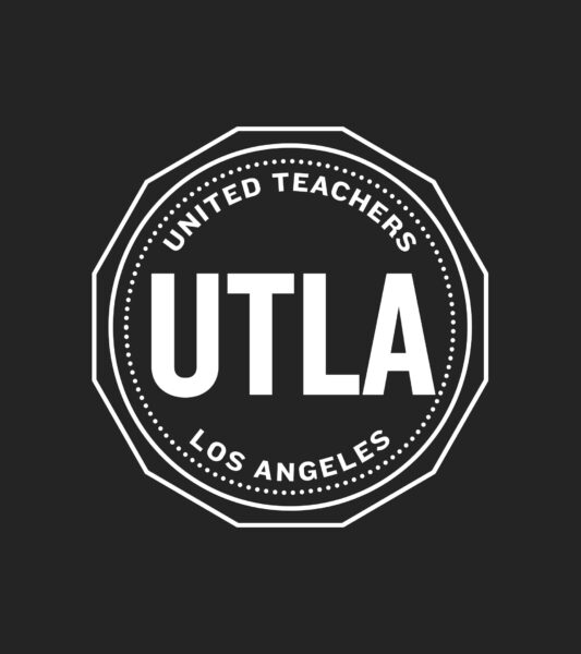
We reimagined UTLA’s logo to reaffirm the brand’s legacy in a contemporary manner while keeping the visual language flexible enough to meet tomorrow’s digital needs. Drawing from their history, we created a 12-point star seal logo to represent the 12 distinct organizations that united to transform California’s public education in 1970.
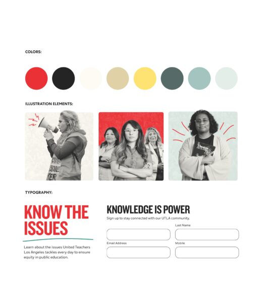
Identity Development — While UTLA’s classic and identifiable color is red, we created a color palette system that would amplify its impact through yellow, gold, and green hues. The application of color in typography and illustration gives us great flexibility in the impact of our messaging.
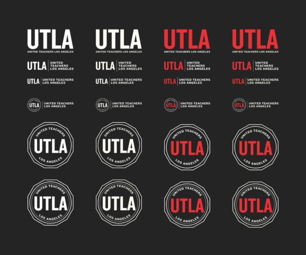
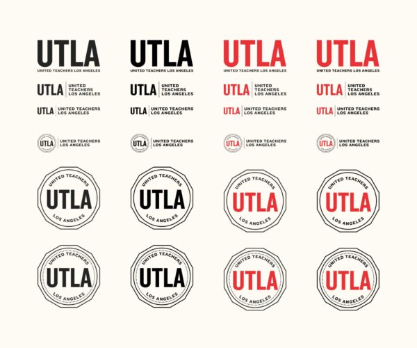
Logo Variations — With various options designed to be recognizable in any size or setting, these logo variations allow UTLA to place their seal of approval anywhere from school board endorsements to rally signs and everywhere in between.
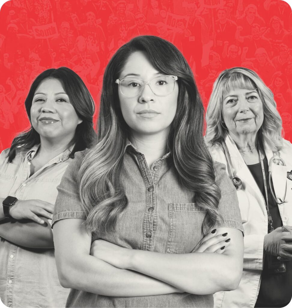
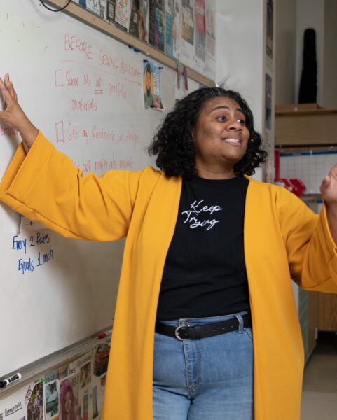
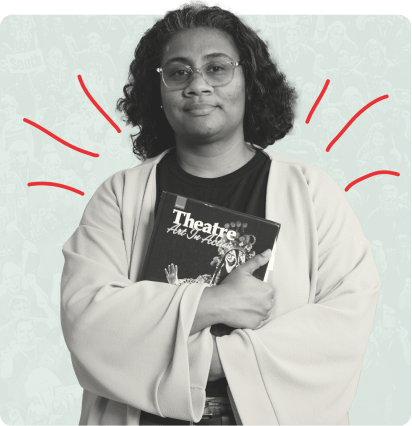
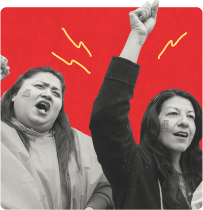
Hero Images — An emphasis on imagery—from portraits of educators to public strikes on the street—connects UTLA’s legacy to the present while spotlighting the diverse make-up of those who push the union’s agenda forward.
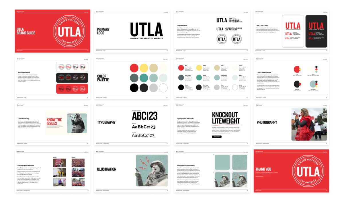
Brand Guide — To create visual consistency for the brand moving forward, we created a simple but usable brand guide that outlines the basics of how to bring UTLA to life. Logo usage, typographic hierarchy, color theory, and illustration techniques are all clearly spelled out to help inform content creation, distill complex information, and draw attention to advocacy opportunities.


Social Media — The new tone is uplifting, direct, and resolute–inspired by student and community-focused language meant to cut through the noise of social media overload. Posts focus on two types of photography, (1) the personal and (2) the powerful, to tell UTLA’s story of impact.
3 — The Website
Knowledge is power
One foundational concept informed our development of the new site: usability. When you advocate on behalf of thousands of people, you need a site that can seamlessly provide people with what they need.
We developed a resource-rich website with a focus on serving UTLA members. Information is now one click away with simple navigation, searchable directories for news, contacts, and events, and a filterable resource center. A user-friendly taxonomy system on the backend allows staff to make regular content updates with the assurance that users will find what they need.
Web Design — We developed a web experiences that prioritizes user utility for the unique needs of various audiences including UTLA members, supporters, and the media, while elevating the visibility of engagement opportunities for all audiences.


Webpage Design — A robust visual brand hierarchy directs the user’s eye through page sections and distinguishes content types, call-to-actions, and interactive links. SEO optimization will ensure UTLA appears in topical searches and drive more like-minded users to the site.


Website Header Illustrations — The brand identity leans into classic school motifs and a historical aesthetic while capturing the revolutionary spirit of UTLA’s work through a new color palette.
4 — Anthem Video
We are UTLA
Achieving equity in public education is a challenging feat. Yet UTLA is unwavering. Why? Because its ability to make a lasting impact is rooted in the magnitude of its collective power.
We set out to make that connection and inspire the next generation by amplifying the humanity of those working in and advocating for public schools. We embraced the imagery of projectors of times past to create a visual experience of transparent layers, brush stroke illustrations, and animations to convey the sense that objects move on and off the screen. The video features a bold voice-over, sporadic drum beat, and powerful imagery to bring this intersectional education movement to life.
Anthem Video — The concept, “We are UTLA,” uplifts the magnitude of the union’s collective power and serves as a rallying cry that inspires unity and excitement among its members.
5 — The Campaign
Red all over LA
We connected the top needs of our school communities and students with UTLA to build support and strengthen public opinion of the union ahead of the next round of contract negotiations.
UTLA’s fresh, unified, and bold messaging rang through in OOH placements across Los Angeles and in multiple languages, further building collective power.
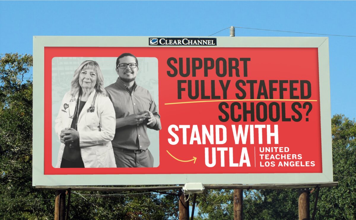
Outdoor Ads — Our OOH campaign utilized polling data to uncover the main issues of importance for parents/caregivers and connected those issues with UTLA to bolster support of the union.


Multilingual Messaging — Understanding the importance that parents/caregivers play in supporting UTLA and the many languages spoken in Los Angeles homes, it was clear that this campaign needed to be multilingual to reach as broad an audience as possible.
6 — The Impact
New look, same fight
By spotlighting the collective power of these educators and grounding their voices in a clear, visually striking user experience, the new brand and site has helped fuel the next chapter of UTLA’s education advocacy.
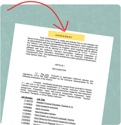
Recently, the UTLA bargaining team reached a tentative agreement with the Los Angeles Unified School District (LAUSD) on a new three-year contract that includes salary increases, class-size reductions, additional psychologists services, expanded support for immigrant families, and an investment in green spaces.
This is a huge, revolutionary accomplishment that we hope will inspire other districts across the country. Equitable education is only achievable with proper investment in human capital, tools, and resources.