Make wonder
Tencue is not your typical event production company. They are powered by storytellers and innovators who connect people to each other and multi-sensory moments of collaborative discovery, pure enjoyment, and deeper reflection. We bottled their ability to make wonder into a new brand, website, and creative launch package.
1 — The Challenge
Experiences for the person in the 14th row
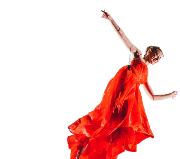
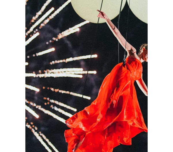
Tencue produces moments that make the audience question what is possible, pushing past limits of imagination and blowing minds. Their immersive productions delight both senses and souls. They needed a refreshed brand and website showcasing their abilities as a creative partner and in constant service of their audience from every angle.

2 — The Brand
A juxtaposition of the expected, and the surprising
In designing Tencue’s updated branding, we chose to think of the brand as a museum dedicated to wonder and connection, exceptionally curated to reflect its multitudes of multimodal expertise. In this sense, the foundational grid-like structure of the branding is one suitable to “hang” art upon.
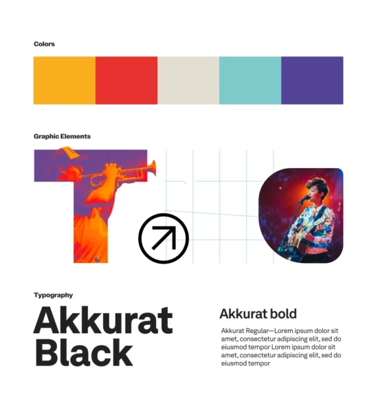
Color palette — The vibrant palette, both exuberant and refined, is inspired by the magical worlds created by Tencue productions.
Custom wordmark — Tencue’s productions are never “cookie cutter” experiences. We created a bespoke and ownable wordmark to match that energy.
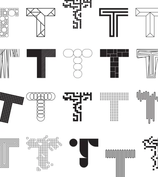

Monogram art — Tencue contains multitudes, and now it’s brand does as well, with an ever expanding and flexible library of monogram art to express themselves.
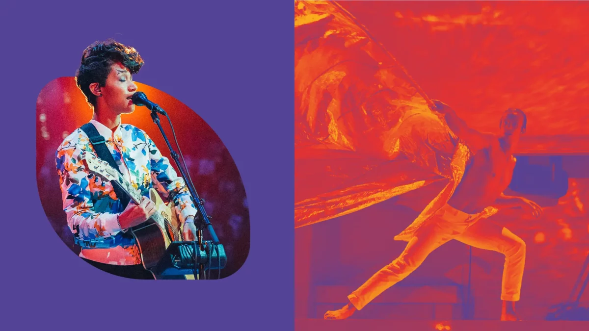
Image treatments — Taking show-don’t-tell to the next level, the image treatments used throughout the brand showcase the vibrancy, quirk, and human-centric nature of Tencue’s work by jumping off the grid with collage and gradients.


Brand guide — The brand guide was intentionally designed as a creative foundation to build upon, grow, and evolve as Tencue’s creative endeavors do, as well.
3 — The Website
Positioning Tencue as an industry leader
Our goal was to bring Tencue’s multimodal approach to life, emulating the experience of an audience member at a Tencue production in order to show, and not tell, that Tencue is a leader in the event production space. We dropped the typical buzzwords, applied purposeful visuals, defined Tencue’s creative approach to demystify the process and build loyalty, curated their portfolio to display their niche, and elevated their biggest differentiator–their diverse creative team.
Interactive rich web — It was important for Tencue’s website to feel like their productions—rich with personalized, micro-interactions that surprise and delight the viewer.
Staff highlights — Tencue is a people-powered experience agency who’s core rule is to break the rules. Their greatest strength is their team of performers who know how to make an audience feel a story.
4 — The Campaign
We are GO for launch
By building a flexible design capable of multiple executions, we were able to develop a neatly wrapped launch package of templates, social posts, and an email presenting the new branding and website.


Social templates — We armed Tencue’s team with a series of templates that can serve any need—from job listings, to announcements, to big project case studies.
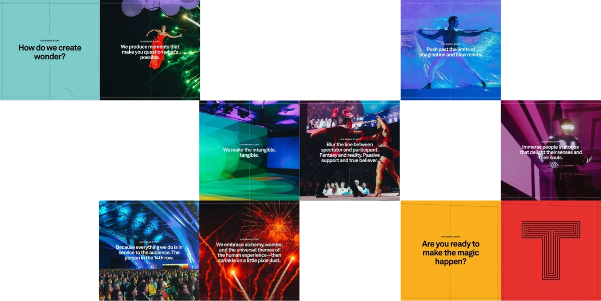
Brand story — We created a carousel social post as the first launch of the new look that did what Tencue does best–tell an engaging story. Language was specifically chosen to engage potential clients aligned with Tencue’s values.
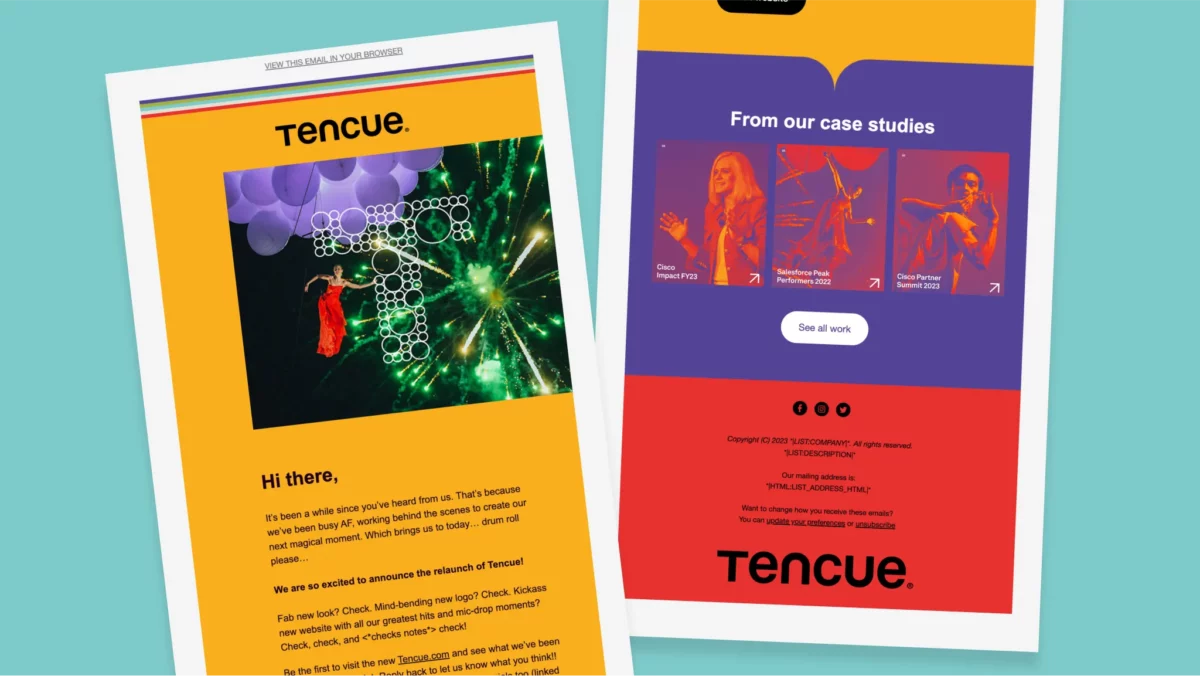
Announcement email — We created a relaunch email introducing the new branding and leading audiences to explore the revamped case studies.
5 — The Impact
Growing the business of wonder
With a fresh new design, communications strategy and templates, Tencue had the tools needed to expand their business by re-engaging previous clients and introducing new prospects to wondrous opportunities.
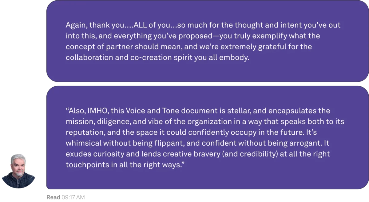
Client Kudos — We’re pumped when the impact of a campaign is felt so deeply by our clients. Our love language is words of affirmation, and Tencue’s Executive Creative Director certainly had some lovely sentiments to share.